
Home / Design Inspiration
The Lusso edit
Find a feeling.
Build a point of view.
The most useful inspiration is specific. Notice a proportion, a contrast or a storage detail that feels right, then consider how it could work in your own space.
Three ways to shape the mood.
These are starting points for a palette, not fixed packages. Mix ideas carefully and let the architecture and everyday use of the room guide the final choices.
01
Light & open
Soft whites and pale mineral tones can create a quiet backdrop. Introduce definition through subtle hardware, a tactile backsplash or a warm floor. Compare undertones so whites feel related rather than accidentally mismatched.
02
Warm & balanced
Wood tones and soft neutrals bring warmth to clean geometry. Choose a dominant wood expression and allow surrounding materials to support it. A small amount of contrast can keep the palette from feeling flat.
03
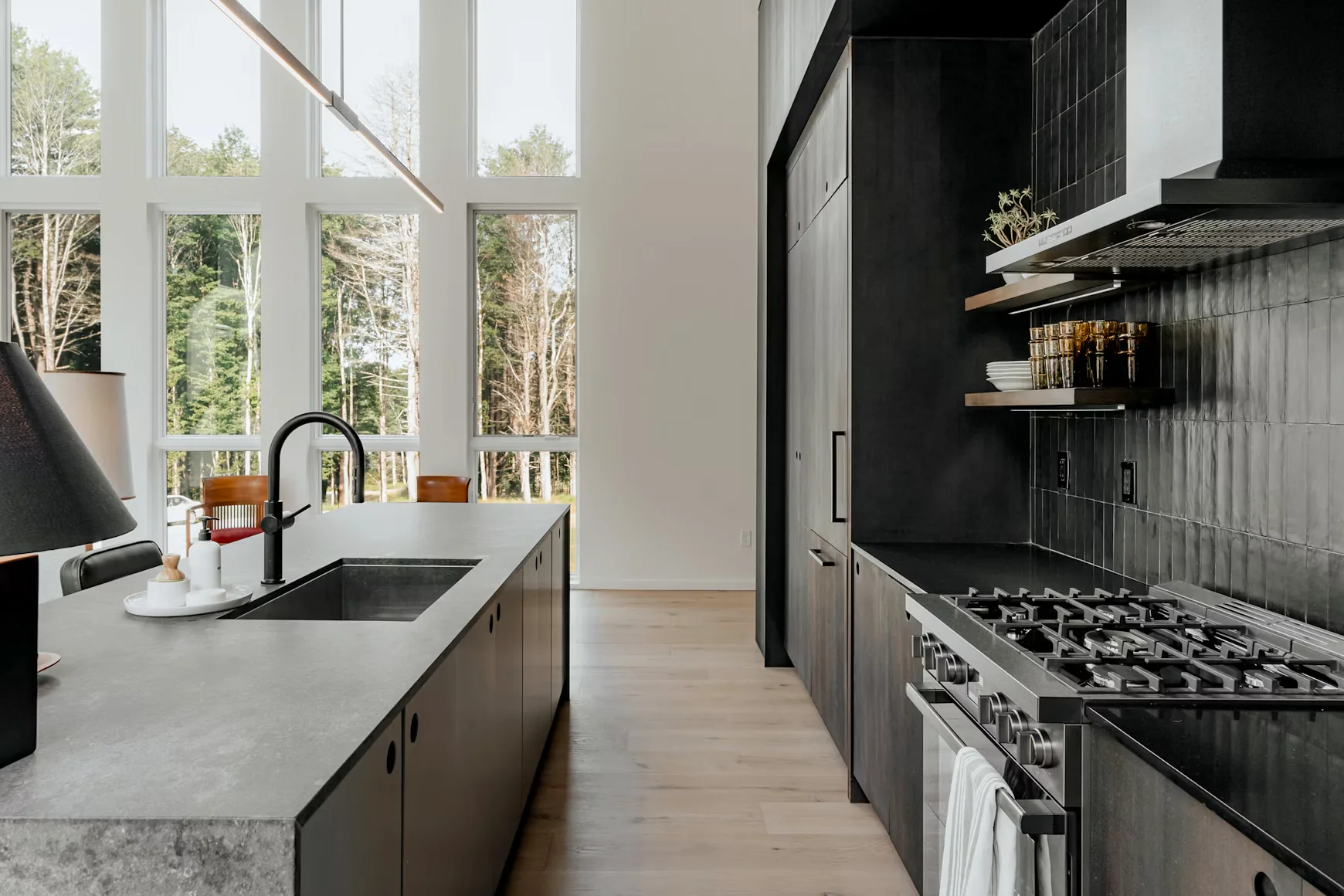
Dark & architectural
Deep cabinetry creates a strong visual frame. Balance it with daylight, purposeful lighting and a lighter surface where needed. Look at the room at different times of day before committing to an all-dark palette.
Visual directions
Two palettes.
One considered approach.
Mood / 01
Bold. Balanced. Architectural.
Deep tones, clean geometry and expressive texture.
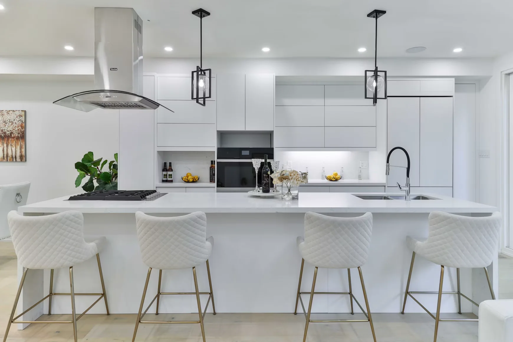
Mood / 02
Light. Open. Effortless.
A softer palette with a clear, contemporary point of view.
Reference interiors for inspiration, not a portfolio of Lusso completed projects.
Read an image, not just a style label.
Ask what attracts you first: the proportions, the amount of light, the color relationship or the absence of visual clutter. A reference image may show a room much larger than yours. Translate the principle rather than trying to reproduce every object.
From idea to clarity
A more useful
starting point.
Collect selectively
Choose a small group of images that share something meaningful. Too many unrelated references can make the direction harder to see. Write one sentence about what you like in each.
Separate mood from requirements
Keep atmosphere references in one list and practical needs in another. A beautiful open shelf may not solve a need for concealed storage; a large island may not fit the available circulation space.
Test the palette together
View real samples as a group and under the light where they will be used. A coordinated palette should still allow individual materials to have their own texture and character.
Good questions
A little more
clarity.
Are these interiors Lusso projects?
No. The imagery on these pages is reference imagery for design inspiration. It is not presented as a portfolio of completed Lusso work.
Do I need to choose a single style?
No. A consistent proportion, material palette or detail can connect elements from different styles. The aim is a room that feels deliberate, not a strict label.
How can I make a smaller room feel calmer?
Reduce competing patterns, plan useful concealed storage and keep important sightlines clear. Good lighting and carefully sized furniture can support that effect without relying on a single decorative trick.
Keep exploring